-
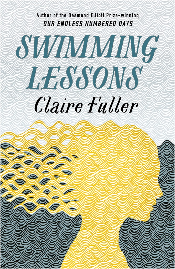
- UK hardback cover
-

- US hardback and Canadian cover
I’ve reached one of the most exciting parts of having a book published – revealing the covers. I’ve known about them for some time, and I’m absolutely delighted with how they look. Here are the UK, US and Canadian covers for my second novel, Swimming Lessons. The original US jacket (on the right) was designed by Diane Chonette, the Art Director at Tin House (my US publisher).
My Canadian publisher (House of Anansi) has decided to use Tin House’s cover as it stands, while Fig Tree / Penguin in the UK has decided to tweak it a little (on the left). I love both of them.
The novel will be published late January / early Feb 2017, and you can read what it’s about here.
And although it’s still many months until publication, you can already pre-order it on Amazon: UK, US and Canada. Or you could wait and buy it from your lovely local independent bookshop.
I’d love to know what you think. Do leave me a comment.

Fabulous cover!
LikeLiked by 1 person
Thank you!
LikeLike
Like the cover. Can’t wait to read it!
A. B.
LikeLiked by 1 person
Thanks Agnes
LikeLike
The cover is wonderful, very eye-catching!
LikeLike
Thanks Minelli
LikeLiked by 1 person
Both are gorgeous but I think I prefer the UK version. The title and author sing out from above the image.
LikeLiked by 1 person
Thanks Susan. Interesting.
LikeLiked by 1 person
It’s a great image, unusual too – less “in your face” than many. The UK one is much better though – I could hardly read the font of the US one at all.
LikeLike
Thanks Jessica. It’s great to hear what people think .
LikeLike
I’m going against the tide here (sorry) but I prefer the US one. The placement of the image seems better to me and I thought that the title stood out better on the US.
Saying that, they are both beautiful. The colours are gorgeous.
LikeLiked by 1 person
Good to hear another point of view. Thank you!
LikeLike
beautiful cover art — I especially like the texture of the image. The many fine lines. Very nice!
LikeLike
Thanks Annette. I’m so happy with them
LikeLike
Love both of them! They really stand out and complement OEND. There are so many similar looking covers around I find that it’s lovely to find something that looks like art
LikeLiked by 1 person
Oh, that’s such a compliment – something that looks like art. Wonderful!
LikeLike
They’re both gorgeous covers, I love how the waves make it seem so textured. Beautiful. I am envious.
LikeLike
Thank you. So lovely to hear what people think .
LikeLiked by 1 person
They’re both beautiful, but I think I prefer the Canadian version. Or maybe I’m just anticipating – can’t wait! 🙂
LikeLike
Hah! Glad you like it Naomi
LikeLiked by 1 person
Love the design — so fittingly fluid. I like the UK version best because your name is more prominent, but both are appealing and distinctive.
LikeLiked by 1 person
Thanks Mary Ann. I can’t choose between them.
LikeLiked by 1 person
I love the design; it’s very striking and would catch my eye in a bookshop and make me want to pick it up – think the UK text pushes the design down too far but I can see the author name easier on the UK one. The font’s easier to read on the UK one but I prefer the title font on the US version.
LikeLike
Ooh, a bit of a combination for you then… so pleased you like it generally though and think you’d pick it up. That’s lovely to hear.
LikeLike
I love this cover, the main image is clever and intriguing, really makes me want to read it (plus of the course the fact I loved OEND so i know how good it will be!)
FWIW I prefer the font of the US version, the handwritten effect matches the handpainted feel of the artwork.
LikeLike
Pingback: Flash Fiction: Add but don’t subtract | Claire Fuller
I feel both are artistic but I prefer the US/Canadian design, because the font indicates movement and vibrant energy to me, like swimming. Both designs are very engaging. Can’t wait to read your new book, Claire. Congratulations.
LikeLiked by 1 person
Thanks so much Ilse. And I just heard that the German version, although it will have a completely different name (An English Marriage) will use the same cover.
LikeLike
Love the covers! I like the US/Canada one best. The letters really swim out to me. Looking forward to reading the book.
LikeLiked by 1 person
Very appropriate! And glad you liked them.
LikeLike
‘Eine englische Ehe’?? Will recommend it to my friends in Germany, when it’s published.
LikeLike
Yes, exactly that!
LikeLike